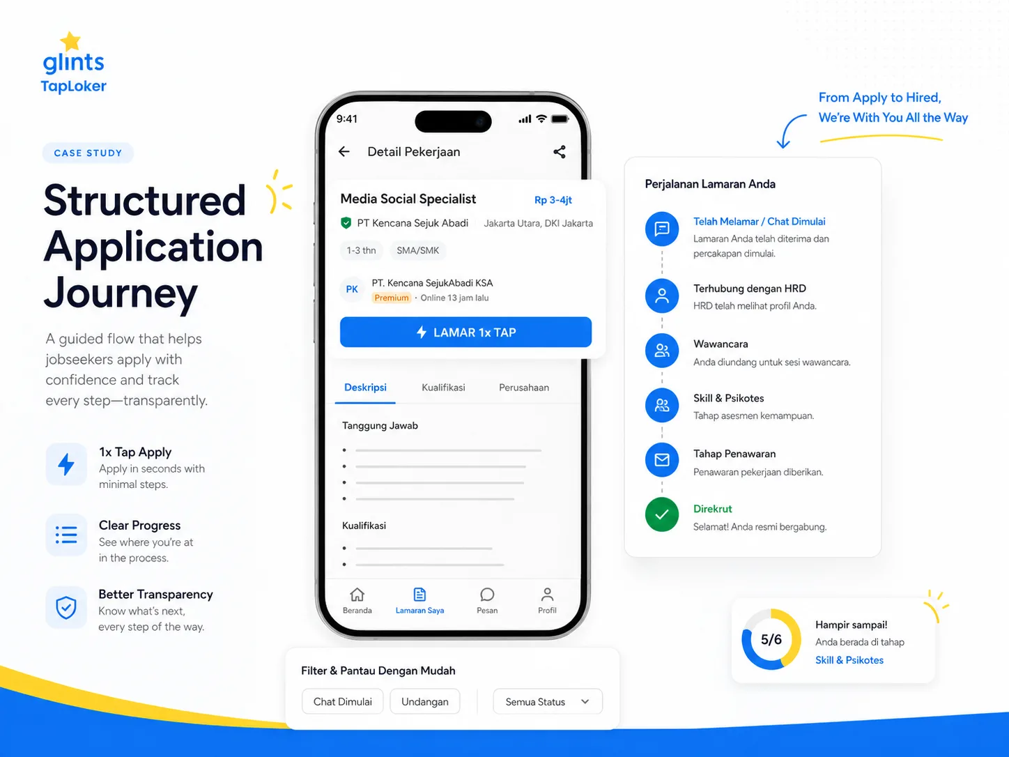
Glints TapLoker displays 100,000+ active job openings in Indonesia, job recommendations, new job notifications, and application status updates inside the app. On the Google Play listing for Glints, Glints also highlights 1x Tap Apply, Bulk Apply, and No Repeated Documents, which shows that mobile job application flows are being pushed toward faster, lighter, and less repetitive experiences.
The 2025 Employ Job Seeker Nation Report says 71% of candidates expect the application process to take less than 30 minutes, 35% would abandon an application if it takes too long, and 66% of candidates who interacted with a recruitment chatbot said it improved their experience. This matters because chat-like apply flows and recruitment chatbots can reduce the friction that usually appears when candidates have to fill long forms from a phone.
Glints TapLoker’s chat feature is not only a conversational apply pattern, but also a form of chat-like notification, conversation seeding, and chat-led reactivation. Users are made to feel as if a recruiter or HR person is reaching out directly, which creates a stronger reason to open the app, read the job post, send a CV, or continue browsing job lists. This pattern can reduce applicant drop-off because the job application journey feels more personal, faster, and more active than a normal job notification.
Haven’t Opened Glints for a While, Then Suddenly Many HR Chats?
You have not opened Glints for a while, then suddenly the inbox looks busy with HR names, recruiters, and companies. At first glance, it feels like multiple people are reaching out directly with job opportunities.
That feeling is very different from a normal notification. If the message only says new jobs are available for you, users can ignore it easily. But when it looks like a chat from HR, the brain treats it as something more personal.
From a UX perspective, this is where Glints TapLoker becomes interesting. The app does not only show a list of job openings. It creates the feeling that the recruitment process is already happening inside a chat room.
There are recruiter names, avatars, active status, timestamps, Applied / Chat Started labels, job cards, opening messages, and buttons like Interested or Not Interested. These small elements make job hunting feel like a two-way interaction, not just browsing a job catalog.
So the real hook is not only conversational apply. The sharper hook is how notifications and inbox messages are designed to feel like HR chats so users return to the app.
What Are Chat-Like Notifications and Conversation Seeding?
Chat-like notification is a notification pattern where the format and wording are designed to resemble a chat message. The goal is not only to inform the user, but to make the user feel invited to respond.
In a job search app, chat-like notifications may appear as messages from recruiters, HR staff, companies, or systems using conversational language. The message is usually short, personal, and tied to an action such as opening a job post, sending a CV, or choosing whether the user is interested.
Conversation seeding is the strategy of planting the first message so users feel that an interaction has already started. The app does not wait for the user to search for jobs from scratch. It starts the flow by placing a message in the inbox.
For example, the app does not only display an SEO Specialist role in a job list. It sends a message like Katon, this role seems to match your profile or There is a new job opening, are you interested?
Technically, this can be powered by automation, message templates, profile-based recommendations, or a combination with human recruiters. So the more accurate terms are not always fake HR chat, but recruiter-like prompt, automated recruiter outreach, or system-assisted recruiter message.
Still, from the user’s perspective, the effect can feel similar. The user feels like a recruiter is starting a conversation, even though part of the experience may be assisted by the system.
Why This Matters for Job Search Apps in 2026
Job search apps have a classic problem: users come when they need a job, then disappear when they get busy, lose motivation, or feel like nothing is moving. This makes retention and engagement a serious challenge.
Candidates also dislike long application processes. The 2025 Employ Job Seeker Nation Report says 35% of candidates would abandon an application if it takes too long, especially when they have to re-enter information already available on their resume.
The problem is not only that candidates are lazy. Often, the flow itself is tiring, especially on mobile. Uploading a CV, filling out data, selecting experience, logging in, verifying an account, and waiting without clarity is not exactly the peak of modern digital civilization.
Chat-like notifications try to solve the issue from another angle. Instead of forcing users to search from the beginning, the app brings job opportunities into the inbox in a more personal format.
From a business perspective, this can increase the chance that users return to the app. From a UX perspective, it makes the user feel that the application process has already started, instead of still being stuck at the browsing stage.
However, this strategy also has a trust risk. If users feel tricked by a chat that looks too human, trust can drop. So the key is not only making the chat feel active, but also keeping the experience transparent.
Deep Dive: Complete Strategy and Execution Guide
Build the Hook Around “An HR Person Is Looking for Me”
The strongest hook in Glints TapLoker’s UX is the personal feeling that appears when the inbox looks active. Users do not feel like they are seeing a job ad. They feel like someone is contacting them.
This is the psychological strength of chat compared to banners or normal push notifications. A banner feels like a promotion. A push notification feels like a reminder. A chat feels like an unfinished conversation.
In the screenshots, several elements strengthen that feeling. There are personal names, recruiter labels, company names, job titles, timestamps, and snippets that mention the user’s name.
This format makes the message feel specific to the user. Even if the content is templated, the packaging still feels personal.
This hook fits job search apps because job seekers are naturally sensitive to new opportunities. A message that looks like it comes from HR carries more emotional weight than a generic product notification.
But this hook has to be handled carefully. If it becomes too manipulative, users may feel disappointed once they realize the message is system-generated. A good strategy can still feel personal without making users misunderstand that every message was manually typed by a human recruiter.
Turn Notifications into an Entry Point for Job Discovery
Normal notifications often only work as reminders. After users click them, they land on a generic page and still have to search by themselves. The friction is still there.
Glints TapLoker’s pattern is more interesting because chat can become a direct entry point into job discovery. Users see a message, open the chat, and immediately see a job card inside the conversation.
The job card matters because it gives instant context. Users do not only read there is a new job opening. They can directly see the position, company, location, salary range, experience requirement, benefits, and job summary.
From there, users can take quick action. They can tap Interested, tap Not Interested, view job details, or send their CV.
This flow makes job discovery feel shorter. Users do not have to return to the job listing page, use filters, type keywords, and inspect one opening after another. The app brings one opportunity directly in front of them.
In UX, this can be understood as guided discovery. Users still have control, but the system helps start the exploration.
Use Recruiter-Like Prompts, Not Generic Push Copy
A message like There is a new job opening, are you interested, Katon? feels more personal than New job available. The difference is context and tone.
Generic push copy usually feels like a mass message. A recruiter-like prompt feels like it came from someone. That makes users more likely to read and consider it.
Still, the language needs to stay efficient. Recruitment chat does not need to be too sweet, too long, or too friendly for no reason. Candidates need quick context, not a motivational ceremony inside a tiny chat bubble.
The ideal format is short, specific, and tied to a next action. It can mention the role, company, profile match, and then give a response option.
For example, Katon, this SEO Specialist role matches your profile. Want to send your CV? That sentence is clear, direct, and action-oriented.
If the message is too vague, users get confused. If it sounds too promotional, users get suspicious. If it feels too human but turns out to be automated, users may feel misled. Digital products love living on this thin line, because apparently plain honesty was too easy.
Use Conversational Apply After Users Show Interest
Conversational apply works best after users show a signal of interest. This can happen after they tap Interested, open a job detail page, or send their CV.
At this stage, chat can collect additional data without making users feel like they are filling out a long form. The questions can be gradual and relevant to the role.
For an SEO Specialist role, the system can ask about SEO tools, technical SEO experience, website types previously managed, or salary expectations. For a sales role, the system can ask about location coverage, canvassing experience, vehicle ownership, and target readiness.
The key is not to show all questions at the beginning. If users are only slightly interested and suddenly get hit with too many questions, drop-off will still increase.
Conversational apply should feel light. One question is answered, then the next one appears. Users also need to know when the process ends.
On the Google Play listing for Glints, Glints highlights 1x Tap Apply, Bulk Apply, and No Repeated Documents. From a UX perspective, this matters because conversational apply becomes stronger when the main profile data is already stored and users do not need to retype the same information again.
Use Application Status to Reduce Candidate Anxiety
One of the most tiring parts of job hunting is uncertainty. After sending an application, candidates often do not know whether the CV was received, read, rejected, shortlisted, or swallowed by some invisible ATS void.
Glints highlights application status updates on Glints TapLoker. This matters because status updates make the application process feel like it is moving, even if the candidate has not received an interview invitation yet.
In the screenshot, a label like Applied / Chat Started gives a signal that the process is already at a certain stage. It looks small, but it has a big effect on candidate experience.
Users do not only see an empty chat. They see a status that gives context: they have applied, the chat has started, the CV has been sent, or they are waiting for HR confirmation.
Status indicators like this can reduce anxiety. Candidates do not have to guess whether their action worked. They can see visual proof that the system has recorded the process.
If designed more deeply, application status can become part of a retention loop. Users return to the app not only to find new jobs, but also to check updates on applications already in progress.
Measure Chat-Like Notifications Through Funnel Data, Not Vibes
A chat-like notification strategy cannot be judged only by saying “it feels interesting.” Product teams need to measure it through a clear funnel.
The first stage is impression. How many users see the notification or inbox message. The second stage is open rate. How many users open the chat.
The next stages are job card click, Interested tap, CV submission, screening response, and apply completion. After that, the team can measure whether users move to interview, shortlist, or the next recruitment stage.
If the only metric is the number of chats sent, the data is not very useful. Many sent chats do not always mean users are engaged. Users may open the chat, realize it is automated, then leave.
More useful metrics include drop-off per stage. For example, users open the chat but do not click the job card. Or users click the job card but do not tap Interested. Or users show interest but do not send their CV.
From this data, the UX team can identify whether the issue is the chat copy, job relevance, job card design, CTA button, job requirements, salary range, or document upload process.
The 2025 Employ Job Seeker Nation Report shows that candidates are sensitive to long application processes. So metrics like time-to-apply, number of steps, and completion rate need to be read together, not separated into a dashboard that looks smart but explains nothing.
Keep Transparency So Automated Chat Does Not Feel Deceptive
The most sensitive part of this strategy is user perception. If the chat looks too human, users may assume they are talking directly to a real HR person. If it turns out to be automated, trust can drop.
The solution is not to remove automation. The solution is to make the context clearer.
For example, the system can use labels like automated recommendation, recruitment assistant, system message, or the recruiter may respond after you send your CV. These labels help users understand what is happening.
Transparency matters because recruitment involves personal data. Candidates may share CVs, phone numbers, work history, location, salary expectations, and professional documents.
In Indonesia, Law Number 27 of 2022 on Personal Data Protection regulates personal data processing and the rights of data subjects. In the context of recruitment apps, the chat flow needs to be clear about what data is sent, who receives it, and what process it is used for.
This trust issue also connects with the broader AI-agent trend. The 2026 Braze Customer Engagement Review says 27% of consumers refuse to share any data with AI agents, even when promised a better or more personalized experience. This signals that automated experiences can be useful, but they still need to feel safe and honest.
Make Chat Language Personal, But Do Not Pretend Too Hard
The language inside a job app chat needs boundaries. Too stiff, and users feel like they are reading a system message. Too human, and users may feel misled if the message is automated.
The best style is usually in the middle. Personal, but not excessive. Light, but still clear. Friendly, but not pretending to be someone’s best friend.
A message like Katon, this role seems to match your profile works because it gives direct context. Users understand why the message appears.
Still, the chat should also explain the reason. Maybe the role matches because of skills, location, work experience, or salary preference. Without that, the recommendation can feel random.
Chat language also needs to stay short. Users should not be forced to read long paragraphs inside a bubble. A chat bubble is not a place for a full essay unless the goal is to make someone’s thumb file a resignation letter.
For an apply flow, each bubble should have one purpose. It can explain the role, ask for a response, send a CV, or update status. Do not mix all of them into one long message.
Connect the Chat to Recruitment Systems, Not Just Pretty UI
Chat-like notifications can look impressive on the surface, but they have low value if they are not connected to the recruitment system. Chat messages need to generate usable data.
If users tap Interested, the system should record intent. If users send a CV, the status should change. If users answer a screening question, the answer should enter the candidate profile or recruiter dashboard.
Without this integration, chat becomes UI decoration. Nice to look at, but not very useful operationally.
In HR tech, chat data can flow into an ATS, candidate CRM, job dashboard, or recruitment pipeline. Recruiters can see who is interested, who has sent a CV, who matches the criteria, and who needs follow-up.
SHRM State of AI in HR 2026 shows that AI is already being used in HR, with recruiting as the most common HR practice area for AI use. This makes the integration between chat, automation, and recruitment pipelines more relevant for job search platforms.
From a product perspective, chat is not the final destination. Chat is the entry point into a cleaner recruitment process.
Avoid Dark Patterns in Chat-Led Reactivation
Chat-led reactivation can be very effective, but it can easily become a dark pattern if handled carelessly. Especially when the app makes users believe a human recruiter is waiting for a reply when that is not actually true.
The safe boundary is expectation. Users can feel assisted, but should not be misled. Users can feel that a role is relevant, but should not be made to believe they are guaranteed to be selected.
A safe example is this role matches your profile. A riskier example is HR is waiting for your reply right now, unless a real recruiter is actually waiting at that moment.
Notifications also should not appear too often. If users receive chat-like prompts from many recruiters every few minutes, the personal feeling breaks. At first it feels important. Later it feels like spam wearing office shoes.
A healthier pattern is based on relevance. Send a message when there is a genuinely relevant job, an application update, a recruiter profile view, or an action the user needs to take.
That way, chat-led reactivation still feels helpful. Not just a trick to drag users back into the app.




Expert's summary
SHRM State of AI in HR 2026 states that AI use in HR is most common in recruiting at 27%, followed by HR technology at 21%, and learning and development at 17%. This makes HR chatbots, automated recruiter outreach, early screening, and system-assisted candidate messaging increasingly relevant as part of modern recruitment UX, not just shiny app decoration for executives to clap at in meetings.
Katon Fajar
B2B tech partner